


 |
| Click this image to view a list of all my discussion posts! |
It's time for some good ol' fashion chat-chitting and debating! Discussion posts are just that! Any bookish topics worth discussing will be put up on Paranormal Indulgence to talk about.
Feel free to leave me some topic suggestions by using my contact form.
Today's topic: Cover Models!
I think it's pretty safe to say that we've all encountered or fallen in love with books that have covers with flesh-n'-blood people on them, right? For me, personally I never know whether I love it when models are placed on the cover or if I hate it. Has that ever happened to you? Is it possible to take a stance on something like this? And how do we react when a cover turns up with cover models we don't like? Do we ignore them and read on or do we move away from them and possibly miss out on a potentially wonderful read?
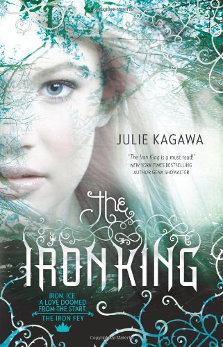
I mean, sometimes you get really great ones like THE IRON KING by Julie Kagawa, for example, where the girl/boy on the cover either looks exactly like the character they're supposed to be depicting, exactly like how you saw them in your head, or he/she looks pretty darn similar! Or better yet, the covers look freakin' spicy and sexy and delicious like with CLOCKWORK ANGEL by Cassandra Clare and SPIRIT BOUND by Richelle Mead, and it turns out that you end up shrugging your shoulders and saying, "Eh, who cares?"

And then there's the okayish ones, where you're like, "Ehh, that doesn't look too bad," like with PERSONAL DEMONS by Lisa Desrochers. Seriously, do these people on the cover look like they're sixteen/seventeen/eighteen? I say, Heck no! And can you honestly tell me that when you picture Frannie and Luc and Gabe that they look like this? Nope, I thought not. But, weirdly enough the cover doesn't look bad despite it. There's something thrilling and dark about this cover that still screams, "Read me! I'm good, I promise!"
But, you ain't seen nothing yet!

How about when a stock photo like this one looks really... awkward? Do you cringe and turn away or do you glance at it and ignore it and keep reading? Something like this looks so... staged. Positively awkward indeed! I just can't get into it. And if it wasn't for the fact that I love Simone Elkeles, I don't think I would be reeled in with this kind of cover. And is that necessarily a bad thing...?
It's frustrating! Are cover models good or bad?!!
It's frustrating! Are cover models good or bad?!!
 |
| How irritating! |
Sometimes, cover models don't matter when the cover looks so gorgeous, right?

But, if it's a creepy book, shouldn't the cover be creepy-looking? A romance book is supposed to equal a romantic cover, no? Don't you hate it when the cover models don't even fit the theme of the book?
(Do these girls make you think... ooo, creepy? Thought not.)

Does this boy's muscular physique make you want to read the book? Then, you've got to think: Does he look like the main character? Wait, do his extraordinary muscles prevent you from caring? Does it matter whether he looks like the guy or not?
Should I not read this book because the cover looks corny and cliched?

Or maybe because the characters on the front don't look anything like how I perceived the characters to be?

Though he is cute, that's not really how I pictured him. At all, to be honest.

This one... kind of weird, actually. Am I right?

I thought I heard something about Italian hotties. Um, but where are they?

Aw, but that's pretty cool and impressive! I definitely want to read that!

See what I mean? Covers have a huge effect on whether or not we readers purchase/borrow/read these books. Should cover models have so much influence on your decision?
Should covers period influence your decision to pick up a book? Do we stick to that wise old saying, "Never judge a book by its cover"? Is the cover any indication as to how great the book is, as to whether we'll like it or not? Does that make us readers shallow and superficial if we ignore books because we don't like their covers? Would we be stupid to pass up a chance to read a certain book because, while the summary may be promising, the cover is not?
Going on personal experience, I've been proved wrong as far as basing my opinion on my impression of the cover. While I may not have liked the cover, after giving the text a chance, I have found that I do in fact enjoy the book. But, I'm a cover girl. I like to buy books just because they're pretty or shiny or foily or sparkly or colorful, even without reading it. And if I find that I'm not completely in love with a book, though I did like it, and I hate the cover, should I buy said book anyway? If I'm not in love with the cover models on the front, would it be wrong of me to not buy the book? Is it wrong to discriminate like that and not support the author due to the fact that the cover doesn't do anything for me?
What do you guys think?
Thanks for reading!

4 comments:
This is a really great post!!! l agree with a lot of what you said!!
I think it does matter a little bit, l think it also spoils the cover when they look nothing like the book explains
So before I comment on the post, I have to commend you on your awesome anime taste. Especially The Melancholy of Haruhi Suzumiya. I loved that one :P. Aaanyway, I completely agree. I just read Personal Demons, and whilst I loved the book, the cover completely did not suit. I think sometimes models work (example: Airhead series by Meg Cabot - US version) but I think most times simple is best (Forsaken DOES look good though).
@booksforcompany I'm glad you enjoyed reading it ;) And I'm so happy to relate with you on that score. Covers do matter. But how much should we let it is the question.
@Liz R. *grins sheepishly* Why, thank you! I actually haven't watched The Melancholy of Haruhi Suzumiya yet but I'm so tempted to and posting up a pic relating to it is my way of expressing how very close I am to sitting to down to watch it. Glad to hear the praise though, because now I'm not so skeptical ;) And including Fushigi Yuugi was a no-brainer simply because I love that damn show.
Aaanyway, I knew I wasn't the ONLY one to feel that way about Personal Demons. Original Sin fits a bit better, but still not so hot for it ('specially since Gabe is holding Frannie like he can on that cover - not digging that!). And you're right that sometimes cover models just make it work and make it gorgeous. It just really depends on how the whole cover is designed, you know? Not everything is meant to look good.
Well, ladies, thanks for stopping by!
Cover models are kind hit and miss for me. I am the person who would turn their nose up at Return to Paradise because of the awkward stock photo. I'd even pass on Personal Demons-- they look like they're in their late 20s and that isn't a sign of YA. I know I'm probably missing out; I'm trying to quit the book cover snobbery.
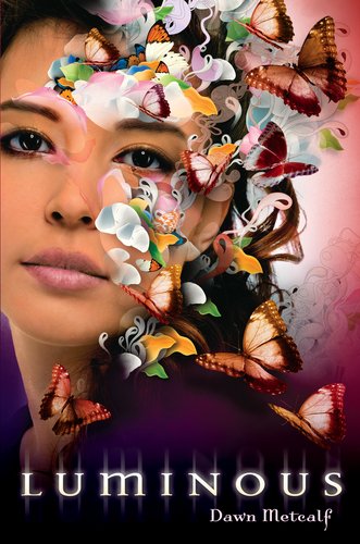
That being said, I'm totally gushing over the covers of Iron King, Luminous, etc. Even Imaginary Girls because at least it looks crisp and interesting.
Post a Comment